Building responsive experiences in a non-responsive app
Recently, at RazorpayX, we wanted to improve the login and signup experience for our users and mobile-first being the norm, we wanted to meet users where they are — on their smartphones. However, the challenge was to make these new mobile-first components fit with a plethora of non-mobile first components — or rather Desktop first components. We also didn’t want to overhaul the entire system by making them mobile-first, just so that the new components could fit in harmony. Given these constraints, we wanted to take incremental steps and build out the system. Here’s what we did.
To start with, we made a separate folder inside our Auth module (simply called v2, yeah, naming is hard) to contain all the newly created mobile-first components so that it’s clear from the get-go that these files need to be looked at differently.

The next challenge was to decide on a framework to support mobile-first responsive web design that worked well with Desktop first components. Like with every company striving to move fast, we needed it yesterday.
Need to implement responsive design faster? Use Tailwind
We’ve been using Tailwind (0.7.2) for quite some time now. It contains flex utility classes and also provides the ability to define widths in percentages. This was the fastest we could start building mobile-first UI components. These utility classes also go hand in hand with the custom styles that we might want to add on top of it. This approach also made sure that we didn’t have to introduce any additional tool or another step in the development process. However, Tailwind only takes care of implementational details. To start thinking about a mobile-first approach, we also needed newer mental models for building them.
Thinking in Components instead of Pages
There are two ways we can build responsive websites. One way is that we can build pages responsive. We make sure the page is responsive and then using multiple media queries we try to fit in different elements of the page inside it. This sure works but is a naive way to do it, and very difficult to maintain too. We have to rewrite things. Thinking in components has the benefit of reusing the markup and styles. We made sure we start building components, make them responsive, the page should then take care of itself. As a result login and signup ended up using the exact same styles with minor changes in markup across different pages. Markups are comparatively easier to maintain than the styles, especially when we are using standard tailwind classes with a pinch of custom styles. In other words, if the login experience scales well across different resolutions, the signup experience would too. Changes in login will have changes in sign up. Consistency for the win.
Calculating Percentages from Pixels
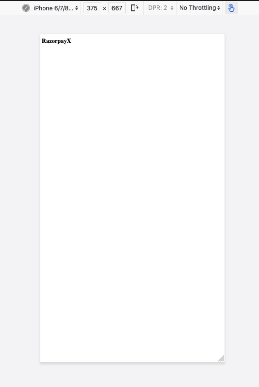
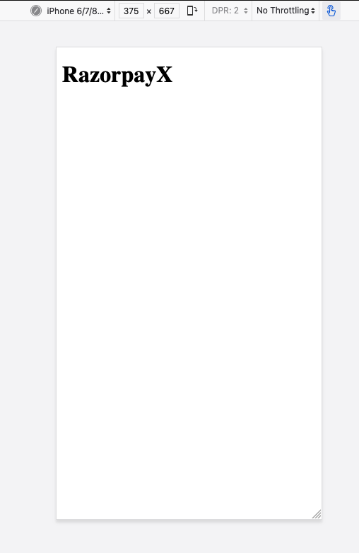
For translating the “components over pages” mental model previously mentioned, we had to start trusting the browser for calculations more than ourselves. Let me explain. One of the misconceptions I had was 1px is the absolute unit of measurement. But, I learned that viewport and resolution are two entirely different things. For eg: the viewport size of the iPhone7 is 375 x 667 pixels and the resolution is 750 x 1334 pixels. When devs say pixels, they generally mean CSS pixels. CSS pixels are just an abstraction. To get rid of all the nitty-gritty details of pixel implementation on different devices, we add this tag in every responsive HTML document:
<meta name="viewport" width="device-width" />This meta tag ensures that our layout area is equal to the device width, which is what we want most of the time. So in the iPhone example this width:50% style would translate to 187.5px instead of 375px.
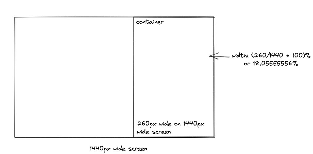
When we get a design in Figma with a mock-up on a 1440px widescreen, and it has a container of say 260px, we can make sure this alignment does not look too wide on a 1024px wide screen and not too small in ultra-wide monitors by translating 260px in percentages and let the browsers resolve it in pixels because they are better at it than us. The way we calculate percentage is by using this simple formula[1]:
target / context = resultIn our example the context would be 1440px — the device width that has our design and target width is 260px in that context. So the width in percentage would be (260 / 1440) * 100 = 18.05555556%. We shouldn’t be tempted to trim the decimals, or round them, because browsers are good at handling them, at least better than us. Similarly, for children components, the context would be the width of the parent.
Reusing styles across Components
We use the sugar flavour of PostCSS — SugarCSS and follow the BEM methodology for custom styles.
BEM provides a developer-friendly constraint which leads to a maintainable architecture. This proves even more useful where we have lots of atomic UI elements and different variants of each of them. For example: for primary buttons, we would have internal markup as
<**button** class=”ui-element button button--primary”>We carry forward this methodology of naming classes up to the parent components such as auth forms. This makes it really easy to reuse styles across components. For example, login and signup form containers are going to have the same styles like width, padding, margin, height so we have a class named- .auth-formand is used as
<**Signup** className=”auth-form”> … </**Signup>**

<**Login** className=”auth-form”> … </**Login**>
along with other classes across different components without interfering with other styles. Reusing styles makes it very easy to maintain in the long run, and also is very fast to write.
Putting it all together with an example
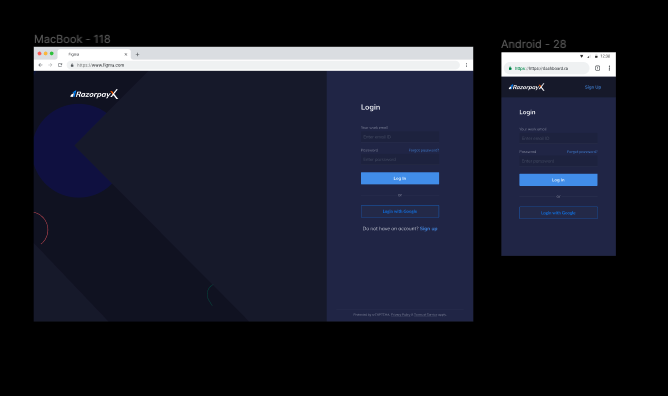
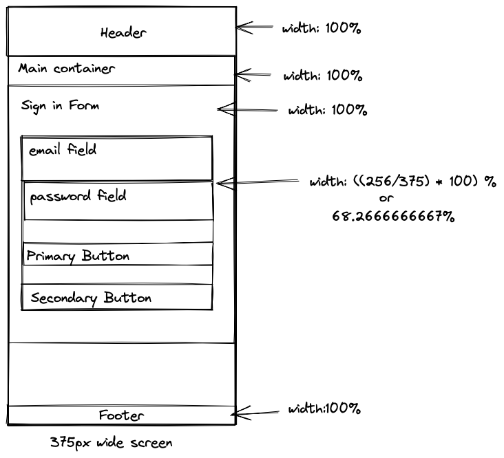
After designers hand off designs (which is generally a mobile and desktop variation), we start by designing mobile-first and progressively enhance the mobile view to fit wider screen sizes.
In this particular example, we can divide the screens into containers. Something like:
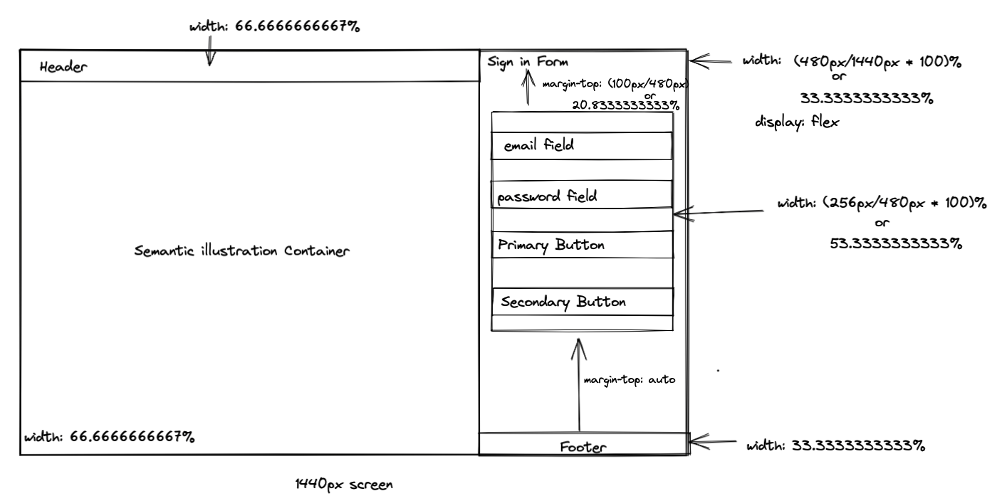
Once broken down into components, it becomes easy to play around i.e., the header can start at being 100% of the viewport but can become about 66.666667% at wider screen sizes. We arrived at this percentage by dividing the width of this box in Figma by the context which is the viewport width in this case. One may prefer margin or padding in pixels as margin-top and margin-bottom are calculated based on the horizontal axis as it makes it a little difficult to understand at first glance. but we went ahead with percentages for the sake of consistency, and added comments behind the calculation for better understanding, something like this:
margin-top: 20.8333333333% /* (100px/480px)*100 */We did the same with the sign-in form. Different people can have different preferences regarding what they would like to call a box, but this is the rough layout we went ahead with:
<div className="auth-illustration auth-illustration — login">

…

</div>

<div className="auth-form-container auth-form-container — login">

  <SigninForm />

</div>
.auth-illustration block will be hidden for mobile resolutions and will be having common styles for illustrations across the login and signup pages. **auth-illustration—loginmodifier will be containing the background of the specific illustration container for login. Similarly, .auth-form-containerwill contain the styles such as width and height which will be common across login and signup. And modifiers **.auth-form-container—login and .auth-form-container—signupwill contain specific styles like left alignment or right alignment. BEM for the win.
The utility classes of tailwind combined with BEM help improve developer productivity exponentially and are easy to maintain as well. For example:
<**div** className=”auth-form”>
  <**h1** className=”font-bold text-2xl leading-loose”>Login</**h1**>
  <**h2** className=”text-base leading-tight mt-1 mb-10 text-gray-50">
    Continue to RazorpayX
  </**h2**>
…
</**div**>
We did not create separate element classes for styles such as font-bold, font-sizes since tailwind exposes them and it was faster to reuse them instead of creating and maintaining a new class altogether. Sometimes we even composed BEM and tailwind utility classes together so that we could have non-standard styles in the element class (like the widths with long decimal places) and also we don’t end up writing styles which tailwind gives out of the box, like:
<Button.Link className=”auth-form__footer_link font-bold”>
 Sign up
</Button.Link>
The flexibility of tailwind to fit in harmony with any existing paradigm and extremely useful utility classes helped us write and reuse styles really fast. We love it.
The Result
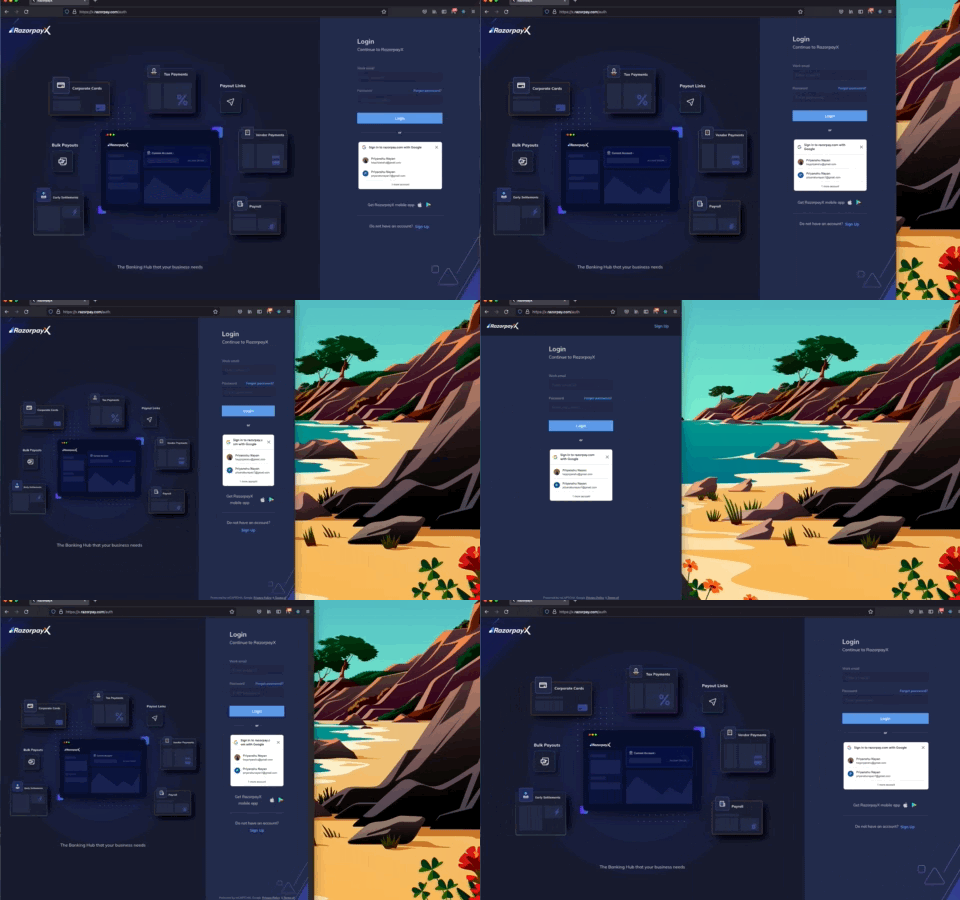
Using these mental models, frontend tools, and responsive thinking we were able to craft blazing fast experiences, iterate and published an enhanced experience for our users. This was what we were able to come up with:
Thanks to Sunand for pushing me to write this and giving insightful comments. Thank you Divyanshu and Prabhas for reviewing and giving suggestions that made this content much easier to understand.
References:
[1] https://abookapart.com/products/responsive-web-design
If you liked the work we’ve done, you’ll be more excited by what we have in store next. If you’re looking out for frontend opportunities, we’d love for you to join our team and help us build the future of payments!
Head over to this link and apply right away → Frontend At Razorpay
Follow Razorpay Engineering on Twitter and LinkedIn for updates on the work we do!
I post more frequently on Twitter. Follow me there to see what I am upto these days!